We are using our own Experience Design Framework to structure the UCAN Go project which we introduced last month.
The four main sectors in the framework help organise :
- thinking around who the design target user is,
- where the app will get used and to note significant factors about the context
- what the primary purpose of the app is and how content will be produced,
- how the user interacts with the app and the interface design.
The framework is also about developing, refining and testing prototypes in an iterative way. We have planned the project in phases. Each phase culminates in a user test to deepen our understanding and to validate or highlight issues with our design.
Activities and understanding for Phase 1.
User persona :
We started with a sketch of a user persona to drive the design decisions in the UCAN Go app. Our persona is
Female, age 20’s, a native user of technology, theatre lover, conscious of their appearance, someone who wants to stand out from the crowd for all the right reasons… not the wrong reasons, who doesn’t want to feel vulnerable and be singled out because they’re Visually Impaired, a confident person who strives for independence.
Common with the majority of the UCAN members our persona has some useful sight and is able to use apps on their phone with accessibility features such as zoom or voice over.
Our first user tests were split over two weeks. In total thirteen members of UCAN participated in a range of activities in which we gathered information about their age, gender, symptoms of their visual impairment and theatre going habits so that we can see how our persona could be developed.
Context :
The first tests were held at UCAN’s base in the School of Optomotry & Vision Sciences building. This was primarily for ease of logistics as we wanted to conduct a range of activities to find out :
– which apps people used
– get feedback on a few popular apps
– how easy it is to estimate distance
– whether our prototype app worked and to gather feedback on it
You can find read about the preparatory activities for the first two workshops in the UCAN blog. The full results and details will be covered in our next blog post.
Whilst the building was not a theatre it was sufficient to test directing the user from the lobby to a seminar room as a simulation for directing the user from a theater lobby to the right entrance for their seat. We chose a route that meant the participants would be taken to a part of the building that they had not been to before.
The exercise forced us to decide what would be the best landmarks to use and how many steps the journey should be broken down into.
Content :
We simplified the scenario for this first test to be a single journey and have deliberately left more complex actions such as selecting destinations, getting lost and finding seats to a later stage of the project.
This allowed us to concentrate on the best way to direct people from the lobby (“a safe zone”) to the auditorium. We knew that getting the language and instructions right is core to the success of the project. By listening to the audio recordings we made from the walk throughs of the theatre we were able to come up with a simple model for orienting, leading and confirming routes through an indoor space. We wrote a text transcript of directions which the UCAN team modified slightly to suit their narrative style. Megan then recorded the directions so that we could break it down into steps of the journey to be used in the app.
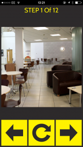
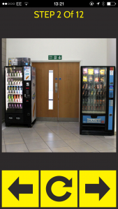
We knew that distance would be a difficult concept, however we felt that the combination of distance plus a photograph could work. We took photographs of each of the landmarks so that each step of the journey had a visual as well as audio reference.
We felt that combining distance with the photograph would give a relative sense of where to look for the landmark. If the distance was 16 meters it is a lot further than 3 meters and so the user would get an idea of where they were looking for confirmation and how long that stage of the journey would be even if they weren’t sure exactly how far 3 or 16 meters might be. It is the same technique that is used in Sat Nav where distance gives you an idea of how close the turning might be, which is then enforced with a turn now instruction and a road name. As we can’t rely on location information to know when the user is at a place it is essential to have a clear description of the landmark to help assure the user they are in the right place. Meetings that the UCAN team had with mobility officers really helped to sharpen up the language that we used and to confirm the last instruction when moving to the next. The mobility officers also gave good advice about the kind of landmarks that could work well for all of the senses.
In addition to the language we also discussed the use of ambient sound effects to emphasise actions. We experimented with adding in a few for the second test.
Interaction :
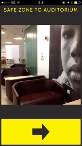
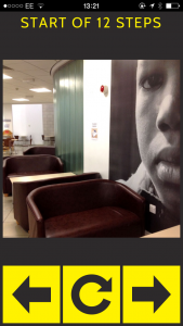
We wanted to keep the interaction model as simple as possible. We designed a user interface with forward, back and repeat buttons that would take you through each step of the journey.
The journey starts with an orientation instruction so that you face the right way. The landmark we used was the large curved wall and sofas which has to be on your right.
Once you were facing the right direction then starting the journey led you through 12 steps including getting into a lift and finding a room.
Pressing the right arrow took you to the next instruction and visual goal. Pressing the left arrow took you back to the previous instruction and the middle button repeated the current instruction.
In summary this simple model worked in all cases, even for an almost completely non-sighted participant who was able to use the audio instructions alone. This was better than our expectations and we will be going through our findings in more detail to see how we might improve the interface and language for the next set of user trials which will be based at the Wales Millennium Centre.
The Digital Research and Development Fund for the Arts in Wales is a partnership between the Arts Council of Wales, Arts & Humanities Research Council (AHRC) and Nesta to support arts projects across Wales that work with digital technologies to expand audience reach and engagement and/or explore new business models for the arts sector within Wales.


